
Our corporate design guidelines support our brand identity by ensuring a unified visual appearance. These guidelines explain how to use basic elements of our corporate design, including our logo, fonts, and color palette.
In addition to augmenting brand recognition, a uniform visual identity ensures consistency across all internal and external communications. Your adherence to these guidelines will help to strengthen our market positioning as a trusted and independent academic publisher.
The following guidelines apply to all design work.
Logo
The De Gruyter logo consists of two elements: the rectangular De Gruyter figurative mark (emblem) and accompanying wordmark (company name). The original proportions of the DG logo must be maintained, and the logo should only appear in the colors black/white.
Logo Spacing
The rules surrounding logo spacing define the minimum distance that must be preserved between the logo and other layout elements.
Logo Positioning
As a general rule, the logo should appear in the margin in the top-left corner of the document. Spacing to the edge of the document equal to one figurative mark in width should be maintained. This rule applies to all usage contexts, across all media. Only in exceptional cases may the logo be freely positioned within the page layout (for example, if the document is only to be used internally). Book cover design represents another possible exception to this rule.
Logo Variants: Imprints


Logo Elements
As a general rule, the rectangular De Gruyter figurative mark (emblem) and accompanying wordmark (company name) should always appear together.
If, in a given design context, there is not enough room for the emblem and wordmark, the wordmark may be used separately. Sole use of the wordmark is also permissible if the format is particularly suitable for it (e.g. design contexts with a narrow banner/landscape format).
Independent use of the emblem and wordmark should otherwise be confined to special circumstances (e.g. internal documentation, or when sharing part of the logo as a design template).
Additional Requirements
When using the logo in your layout, you must ensure that it displayed clearly and that there is no interference from other design elements. Use the black version of the logo when the background is of a light color, and the white version of the logo when the background is of a dark color.
Do
Don't
Typography
De Gruyter’s corporate identity makes use of two typefaces: Gotham, a modern and legible sans serif typeface, as well as Times, a transitional typeface. Both typefaces are ideal for De Gruyter, as they have a timeless appeal yet also complement De Gruyter’s image as a contemporary academic publisher. A key hallmark of De Gruyter CI is the robust simplicity of the Gotham Bold typeface set in all caps.

Typeface by Context


- Curabitur varius mi tortor
- Donec imperdiet nunc
- Sed dignissim urna


Italics can also be used to emphasize individual words or sentences.
Corporate Dash
The corporate dash is a significant design element that helps to visually organize a document.
The size of the corporate dash is proportional to the dash located within the De Gruyter logo when the corporate dash and the logo appear on the same page/within the body of work. The corporate dash’s size is therefore approximately 50% longer and 10% thicker than the dash within the De Gruyter logo (emblem).


Color Palette
De Gruyter’s CI does not foresee the use of a specific color palette. Rather, color selection should reflect our desired image as “traditional, but not stuffy.” As a general rule, a fair amount of black must be used in all design contexts. This requirement can be fulfilled through the use of the black logo in combination with black typography.
Primary Color
Black stands for classic, elegant and bold.
|
HEX
#000000
|
Pantone
|
|
RGB
0, 0, 0
|
CMYK
0, 0, 0, 100
|
Secondary colors
|
HEX
#8A8B1D
|
Pantone
384 Solid C
|
|
RGB
148, 148, 31
|
CMYK
45, 27, 100, 20
|
|
HEX
#8C7E5E
|
Pantone
2325 Solid C
|
|
RGB
140, 126, 94
|
CMYK
40, 38, 60, 25
|
|
HEX
#CACAC9
|
Pantone
420 Solid C
|
|
RGB
202, 202, 201
|
CMYK
25, 18, 20, 0
|
|
HEX
#007596
|
Pantone
7705 Solid C
|
|
RGB
0, 117, 150
|
CMYK
100, 40, 25, 5
|
|
HEX
#A81266
|
Pantone
234 Solid C
|
|
RGB
168, 18, 102
|
CMYK
30, 100, 20, 12
|
|
HEX
#615B66
|
Pantone
2363 Solid C
|
|
RGB
97, 91, 102
|
CMYK
55, 50, 35, 40
|
|
HEX
#AF860E
|
Pantone
1245 Solid C
|
|
RGB
175, 134, 14
|
CMYK
25, 40, 100, 18
|
Accent colors
- Accent colors may only be used in combination with black.
- Do not adjust their respective color values or saturation levels.
- Moreover, they should not be combined with one another.
The exception to these rules are when accent colors are used in diagrams or data visualization.
|
HEX
#00C7B1
|
Pantone
|
|
RGB
0, 199, 177
|
CMYK
70, 0, 40, 0
|
|
HEX
#FFB81C
|
Pantone
|
|
RGB
255, 184, 28
|
CMYK
0, 30, 90, 0
|
|
HEX
#BF4DA5
|
Pantone
|
|
RGB
191, 77, 165
|
CMYK
30, 80, 0, 0
|
|
HEX
#008AD8
|
Pantone
|
|
RGB
0, 138, 216
|
CMYK
80, 35, 0, 0
|
|
HEX
#F18070
|
Pantone
|
|
RGB
241, 128, 112
|
CMYK
0, 60, 45, 0
|
Open Access Colors
In addition to the vivid open access orange, open access designs should include extensive use of white and light gray.
|
HEX
#F18700
|
Pantone
151 C
|
|
RGB
241, 135, 0
|
CMYK
0, 55, 100, 0
|
|
HEX
#CACAC9
|
Pantone
420 Solid C
|
|
RGB
202, 202, 201
|
CMYK
25, 18, 20, 0
|
|
HEX
#FFFFFF
|
Pantone
|
|
RGB
255, 255, 255
|
CMYK
0, 0, 0, 0
|
In Digital Products
In digital products, color plays a particularly important role. It is important colors are used to enhance functionality, accessibility and usability. For this reason, digital products uses a modified color system.
Visual Language
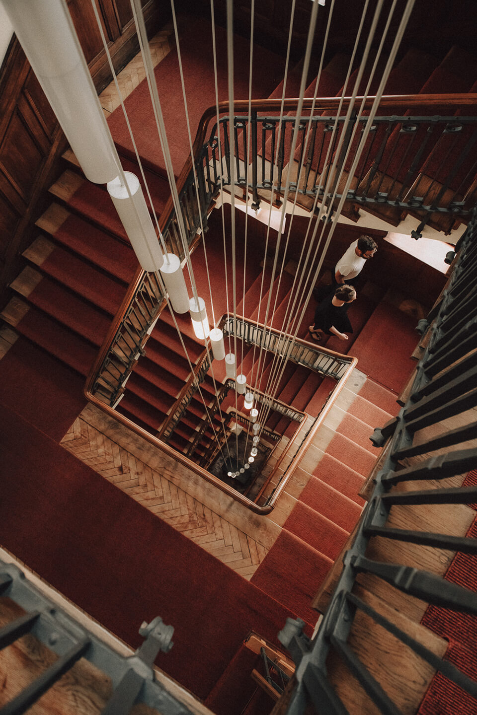
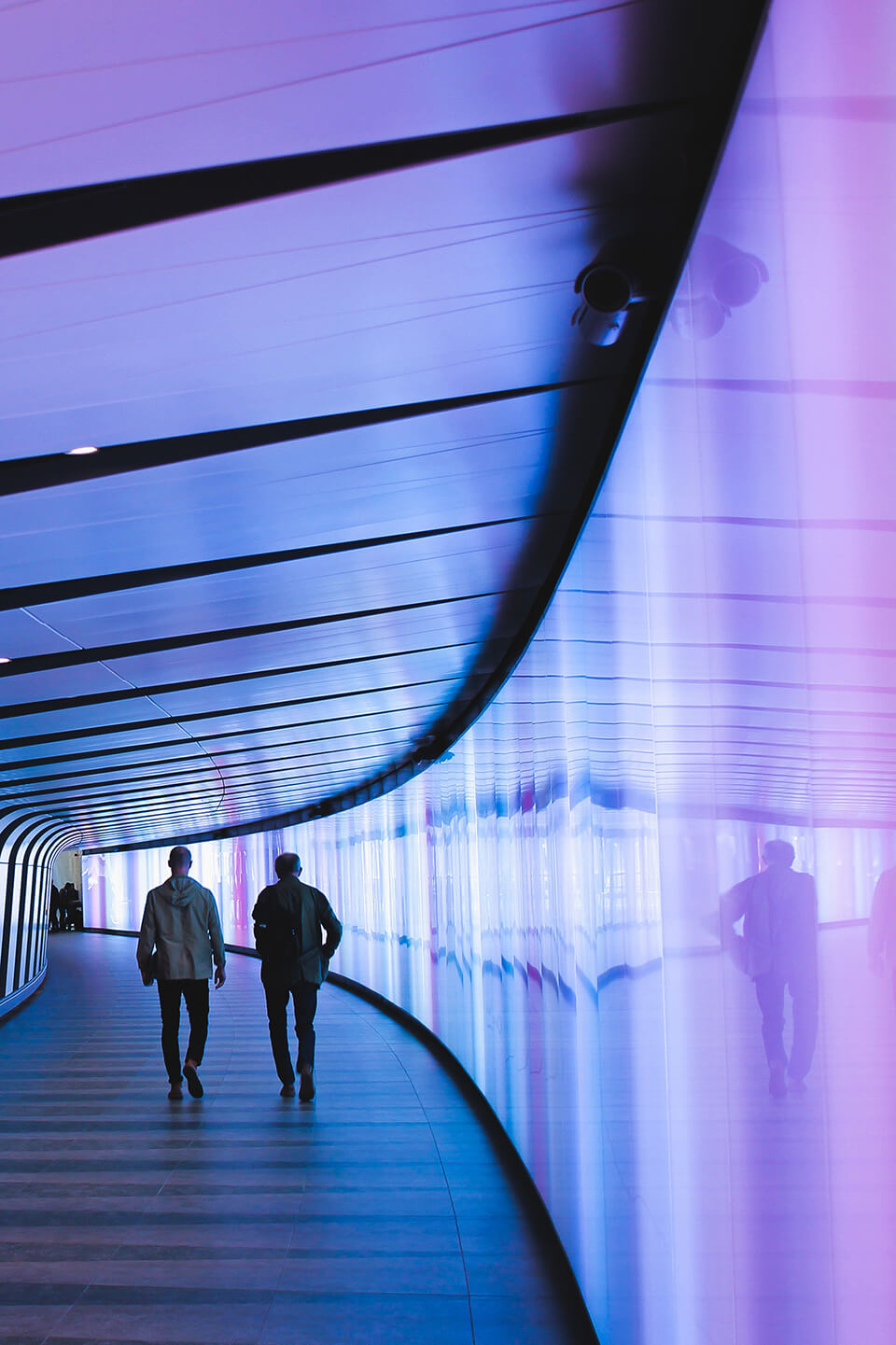
Genuine & With Heart
Imagery should convey a feeling of authenticity and likeability. Images should emphasize De Gruyter's commitment to respecting diversity across ages, genders, cultural backgrounds and ethnicities.
Formal Aspects
- Vivid and warm colors
- Wood textures
- Foreground in focus
- Interplay between focused and blurry image elements
- A portion of the image should be low-key or dark or in shadow
Example Objects
People: authentic, personable, likeable, concentrated, in focus


Books: the portrayal of books together with people is preferable


Digital Products: dark, with focus on light emanating from digital device


Open Access: In addition to the visual language options discussed above, open access publications may also feature abstract orange imagery or images with an orange color gradient.


De Gruyter Values
Partnership: Authentic, diligent, likeable, personable


Competence: Creative, professional, traditional, modern

Openness: Multicultural, cosmopolitan, zest for knowledge, dedicated to scientific inquiry
Courage: Innovative, visionary, digitally-minded, forward-looking

Employee Photos
The photos are taken in a photo studio in Berlin. The look of the employees is natural and friendly. The formal attributes are: frontal, not centered, cropped, grey background.


Employee Photos © Koroll
Iconography
Our icons provide orientation for the reader and user by drawing attention to important information. While our icons can be used in a wide variety of design contexts, as a general rule they should always be combined with text, rather than appearing by themselves. We distinguish between simple and complex icons:
Simple Icons (single color) Our simple, single-color icons are functional, which means they are used for action-oriented content.
Complex Icons Our complex icons have a descriptive function.
Both icon types are also available in open access variants. The complex variant features the typical open access orange.
Icon Construction
Our icons are based on line drawings and follow a defined grid system. Pre-deterimined different sizes of icons are available for digital products. For print applications the sizes can be scaled.