Videos are an important medium for telling stories that strengthen De Gruyter’s brand image. By following these design and brand image guidelines, you can be sure to present De Gruyter in a consistent and professional manner.
Design
Be sure to apply the guidelines concerning typography, colors, and images found at the Branding Basics page. In general, De Gruyter videos should be authentic and personable. The narrative style should be professional, but also entertaining (for more on this, see Language). Clarity should serve as an essential stylistic element in the visual conception of the video.
Logo
Intro and Outro
The De Gruyter logo should be displayed at the beginning and end of all De Gruyter videos. We have developed an animated intro and outro that you should use for this purpose.


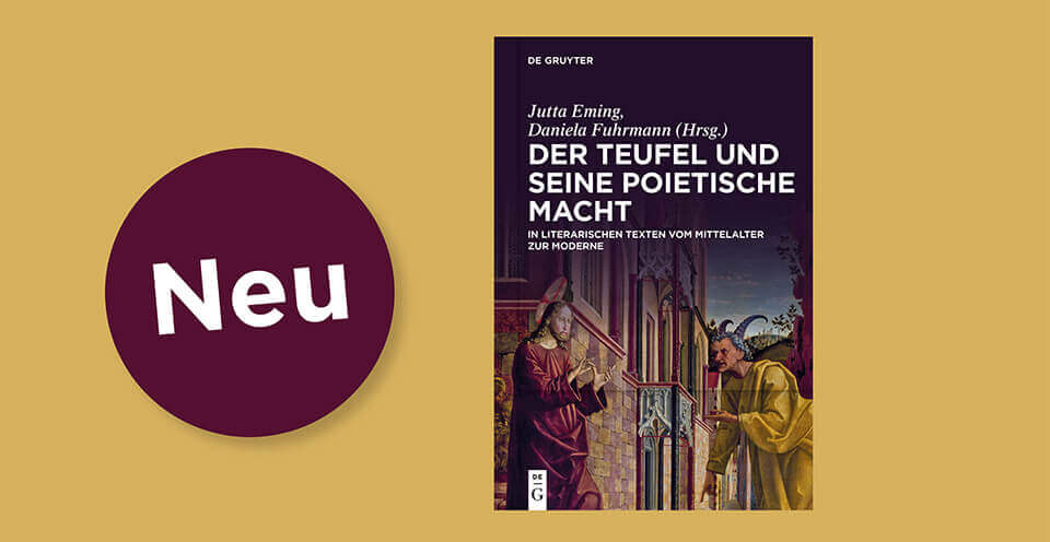
If your video is promoting a book prior to the outro, please use the template available at Canva.com. For login information, please contact the Communications Team.
Logo placement
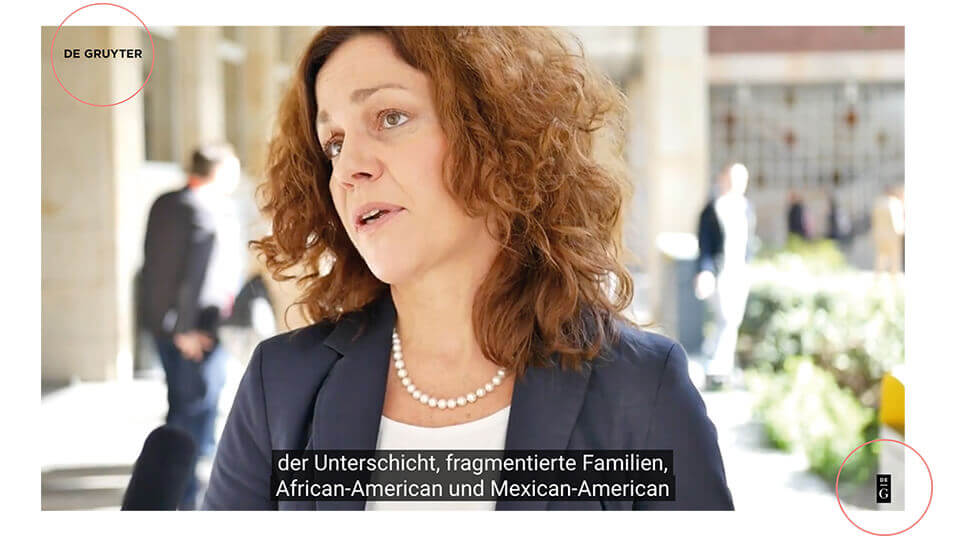
During the video, it is not necessary to display the De Gruyter logo on a continuous basis. If you would like to integrate the logo, add the wordmark (company name) to the upper left corner. On YouTube, the figurative mark (emblem) is also automatically displayed as a clickable overlay in the lower right corner. It does not have to be inserted into the video.
Style
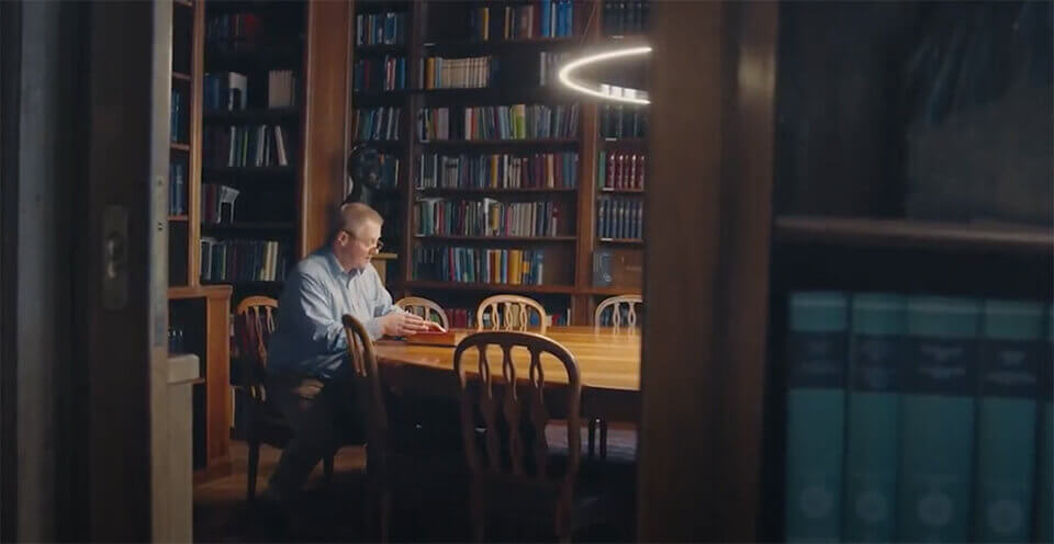
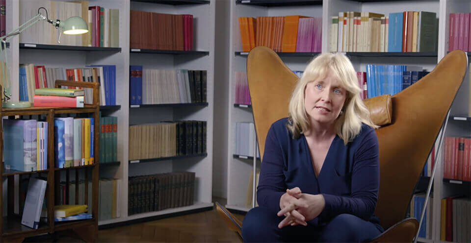
In light of our role as an academic publisher, the visual frame should always be characterized by clarity and balance. De Gruyter videos show authentic moments, i.e. people talking or thinking.
In motion design, dynamic elements should be clear and elegant. Our guiding principle for videos is:
“Simplicity is key.”
Guidelines
-
Start with a storyboard: What kind of story do you want to tell? Start by formulating a clear message. Next, sketch out the storyline. A storyboard can also be helpful for filming interviews – cutaway screens with questions or key terms can help to guide the conversation.
-
The right setting: Make sure you have a natural and attractive environment, whether indoors or outdoors. Monochrome, flat backgrounds are also possible, if they fit the content of the video.
-
The protagonists: Persons appearing in the video should dress in their usual style – they should not appear “dressed up.” Tip: Avoid patterned clothes.
-
Ensure sufficient light: Use the available natural light. If the setting is too dark, use artificial light sources or, if possible, shoot outdoors.
-
Shooting: Set a point focus by playing with sharp/blurry contrasts. This makes cluttered or distracting backgrounds less important. Static shots are preferable. If you need to move the camera, do it deliberately and slowly.
-
Combining footage with text: Use text sparingly, to avoid competing with the moving image. Avoid redundancy. Formulate short and concise texts that can be quickly understood.
-
Good sound is as important as a good picture:Use appropriate microphones and avoid noisy environments to minimize background noise.
-
Music: The goal here is to translate the qualities of “traditional” and “modern” into the language of music – that is, to combine classical music with modern elements. The musical arrangement should have a progressive dynamic that allows parts of the video to have heightened intensity and emotive affect.
-
De Gruyter branding: Black should be the guiding color. This can be achieved very subtly through typography, clothing, individual objects, etc.
Best Practice
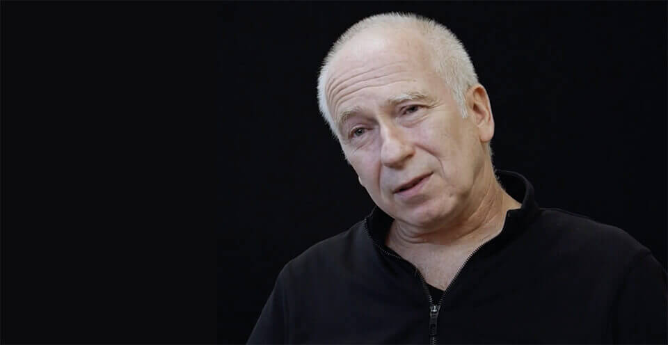
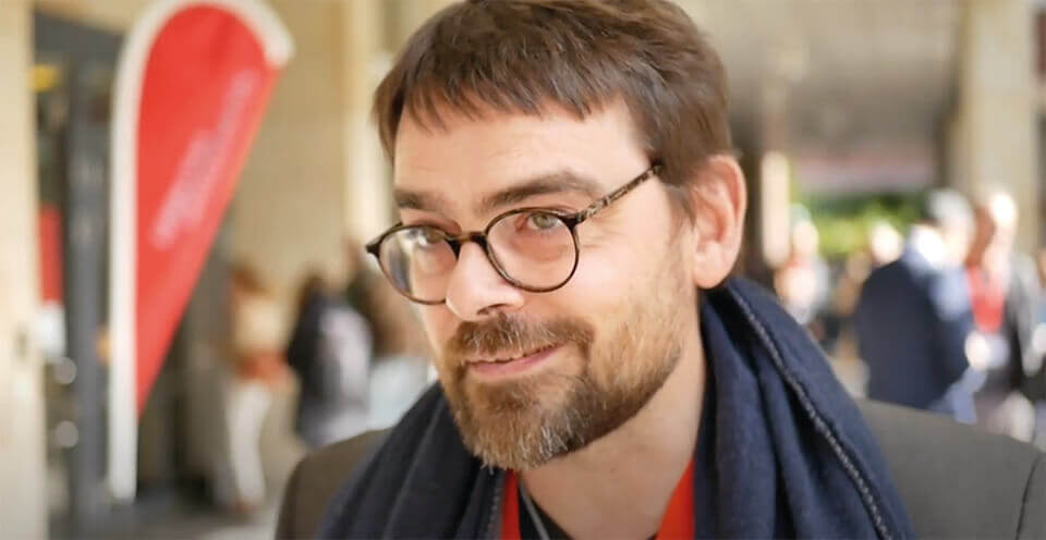
Text in Videos
Typography
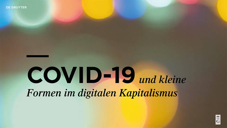
When typography is used, it should be bold and striking. In practical terms, this means using large font sizes and concise forms of expression – including individual words – superimposed on an image or background surface.
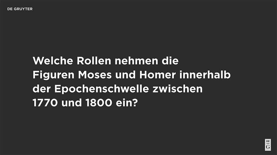
Lower Third/Text Overlays
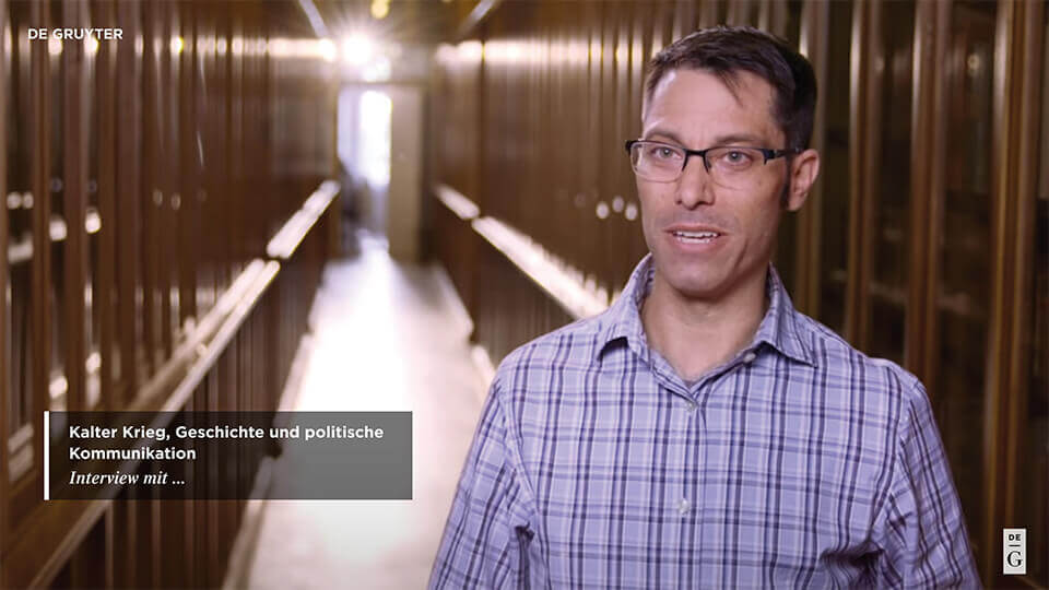
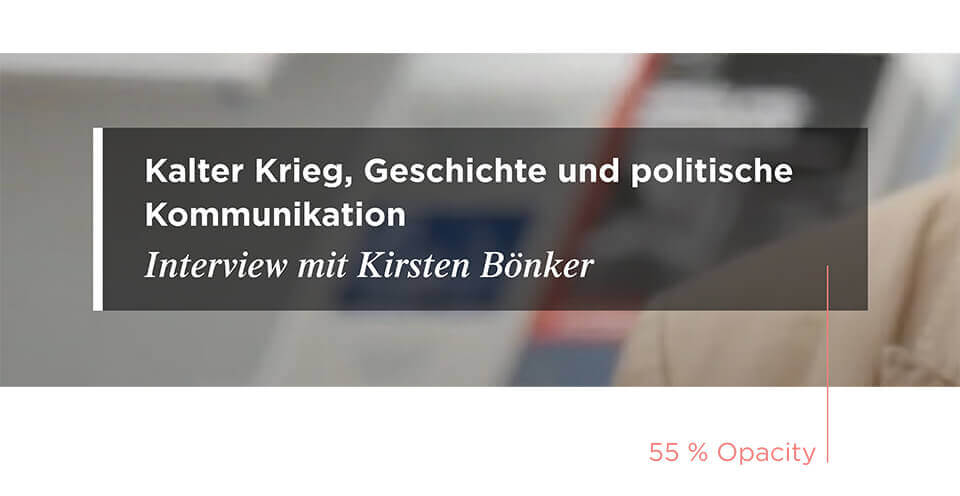
To ensure that your text stands out and is easy to read when the background is busy or cluttered, you should superimpose the text on a transparent bar that occupies the lower portion of the screen. The height of this bar is determined by rotating the DG Corporate Dash 90 degrees. The text should be displayed for at least one second.
Subtitles
Subtitles are not only beneficial for viewers with hearing impairments. They can also be helpful for other audiences, such as people who are unfamiliar with the language of the video or mobile users who have turned off their sound or cannot hear it because of ambient noise.
Most platforms have an option for automatic subtitle creation. If a given language is important, you should check and correct the automatically generated subtitles.

Thumbnails
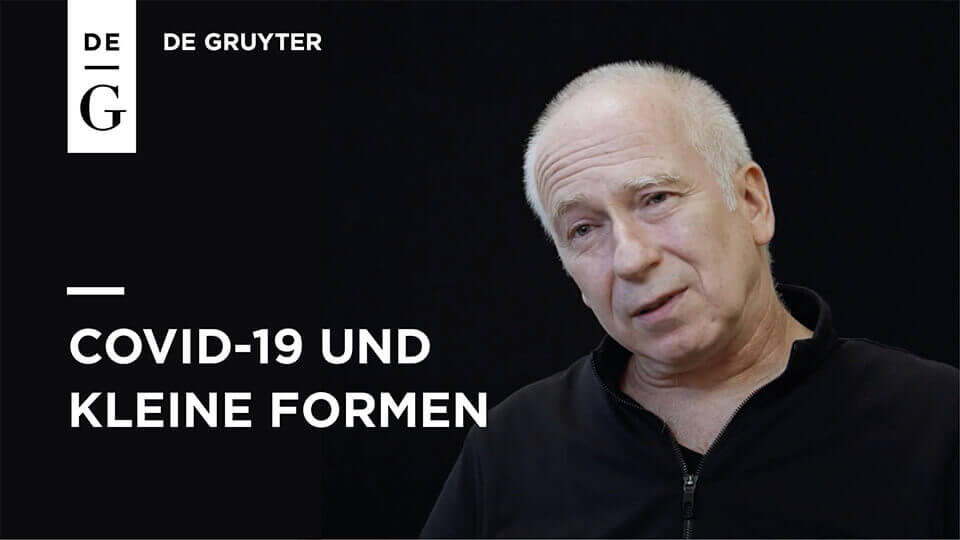
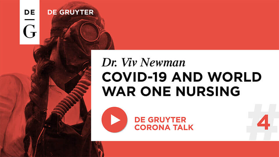
Thumbnails are small preview images. They should be designed to arouse interest in the video, as they contribute significantly to the click rate. A good thumbnail choice for interviews is an image of one or all of the participants. Numerous templates are available at Canva for different video formats.

Online Events
VIDEO CONFERENCES (ZOOM, TEAMS)
During a videoconference session, make sure that the background is calm and tidy and that there is enough light. For the best sound quality, use a headset or external microphone.
Intellectual Property & Declaration of Consent
All persons featured in De Gruyter Videos, including interviewees and other clearly visible persons, must provide written permission for the use of their image and/or voice in the video.

